
LUX
Editorial
Create a visually compelling and thought-provoking magazine that explores how women can be misrepresented within certain markets. The publication should celebrate diversity, authenticity, and respect in its portrayal of women, aligning with LUX's brand values of empowerment, sophistication, and inclusivity.

Initial image inspiration
Tools:
Adobe Photoshop
Adobe Illustrator
Adobe InDesign
Platform:
Print
Digital
Key Features:
A magazine with a clean, elegant design that adheres to LUX’s branding standards, including typography, colour palettes, and tone of voice.
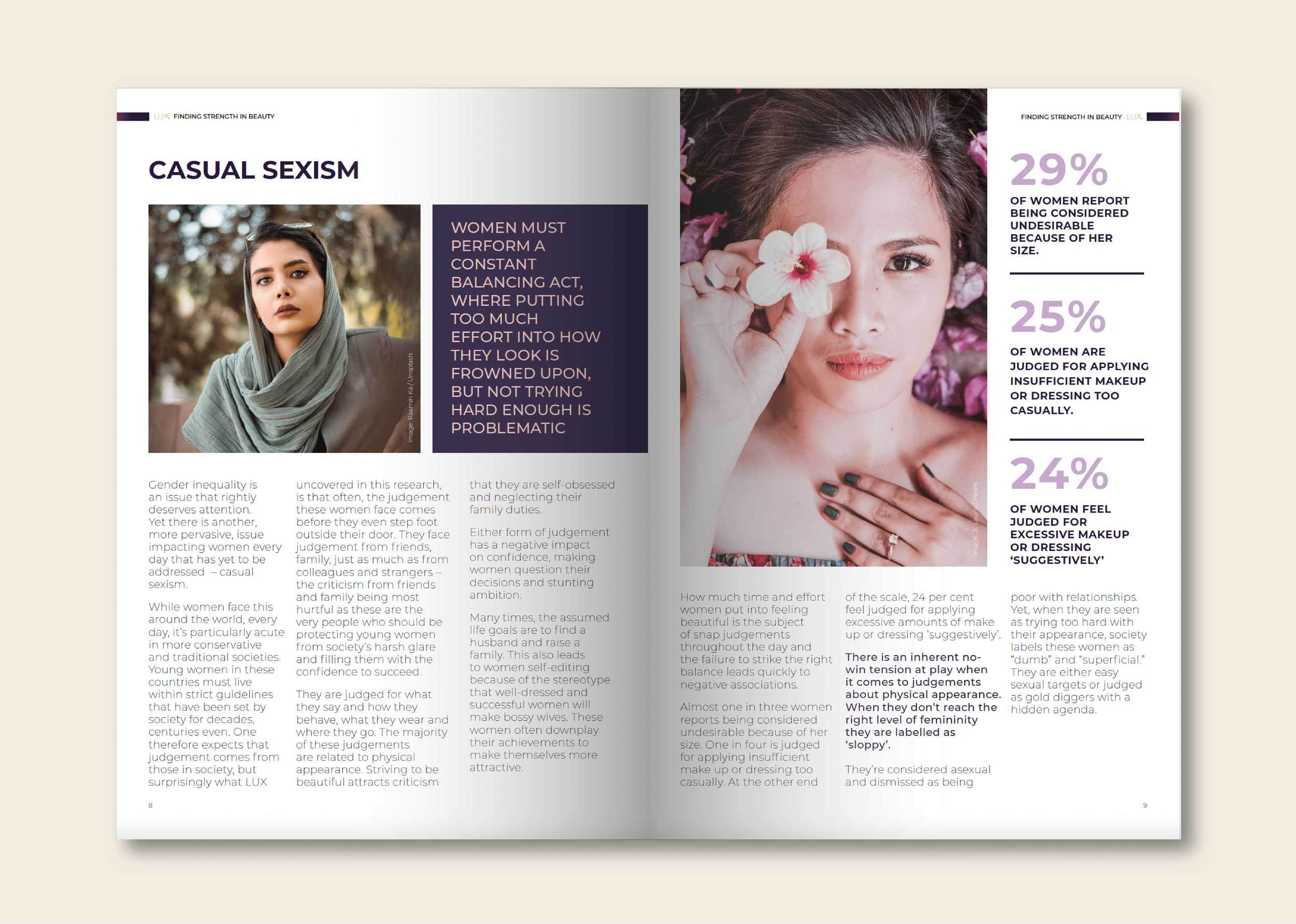
Feature diverse representations of women across various cultures, backgrounds, and professions to ensure inclusivity and respect.
Develop creative layouts with a balance of striking visuals and well-researched content, including case studies, interviews, and infographics to illustrate key points.
Design elements that provoke thought and inspire change, encouraging brands and consumers to challenge stereotypes and promote genuine representation.
Tone and Style:
Elegant, empowering, and respectful.
Avoid any imagery or language that perpetuates stereotypes or misrepresentation.
Goals
Raise awareness of the challenges and opportunities in representing women authentically in marketing and media.
Inspire brands and creatives to uphold inclusivity and diversity in their campaigns.
Strengthen LUX’s positioning as a brand that champions women’s empowerment and beauty beyond stereotypes
Layout & Flat plan
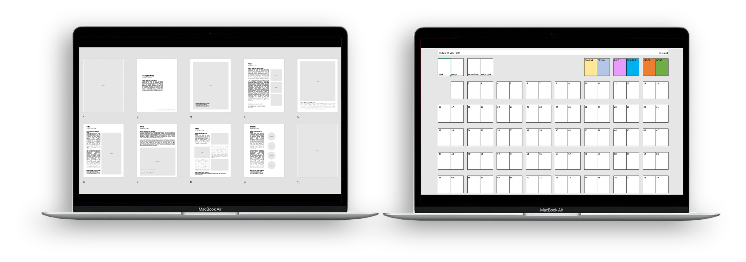
In the early stages of the project, my focus was on creating layout templates for populating articles and information. Traditionally, colleagues produced reports through research and desktop analysis, so these templates were designed to be easily replicated. They could seamlessly replicate their work within the template, including images and references as needed. This was in also in a format that could be shared with a copywriter alongside creation. Once the design phase began, I maintained a publication flat plan to track the project’s progress, ensuring all stakeholders had full visibility throughout the production process until completion.


The Outcome
After distributing the magazine across various markets, it received overwhelmingly positive feedback. Consumers, accessing it through the website, frequently shared how the magazine resonated with issues they had personally experienced, emphasising the importance of positive representation. The visually striking design and impactful imagery prompted the team to approach me for a website redesign, ensuring the platform aligned with the aesthetic and guidelines established in the magazine.